Monday, 13 December 2010

Nosebleed


On a number of metrics, the "risk ON" trade entered "nosebleed" territory (a lot of inverted commas here). Sentiment indicators reached levels of bullishness last seen at three important points: April 2010, October 2007 and July 2007. Price action from the 30 November low is finishing a structure that needs to correct at least 2.5-3%.

This is a daily chart of the German DAX. Presented on the chart is the most bearish scenario, which I weight at around 50% probability.

This is a daily chart of the US two-year note future, which suggests that rates are likely to fall in the next few weeks (prices higher).

This is a daily chart of the German two-year schatz future, which also suggests that rates will fall in the short-term.

Tuesday, 16 November 2010

Wave Three Down?

If this morning's weakness in European equities continues (and equities do not rally to yesterday's highs), we could see dramatic acceleration to the downside.

This is an hourly chart of the French CAC40, labels are not changed from yesterday.

Monday, 15 November 2010

Air-pocket?

By my calculations, risk will either sell-off very hard very soon, or will continue to rally until the end of the week.

This is an hourly chart of the French CAC40. The index fell in an impulsive fashion last week. The move up, so far, could be interpreted as a classic, fast and furious counter-trend zig-zag, pending a move lower, which would be the third wave.

Friday, 12 November 2010

Boom, Boom, Pow...?

Asset markets have likely peaked for 10-15% corrections.

This is an hourly chart of the US Energy sector, which at 11.68% of SP500 is the third largest sector in that index. The pattern here suggest that we fall to at least the level of triangular consolidation, marked by blue lines.

This is a daily chart of the Australian index I used on 19 October 2010 to forecast an exhaustive rally. The chart has not been updated but for the actual traded data. It appears the index topped and subsequently declined exactly as expected. This further suggests that the decline will continue.

This daily chart of the Australian dollar against the Japanese Yen suggests that we are topping around current levels. There is an outside chance (about 30%) that we rally to around JPY83 before rolling over.

One of the reasons why I am not expecting declines of greater than 10-15% for major indices is because a lot of Asian indices do not appear "complete" on the upside. They do appear to be ready to enter a prolonged (about 4-6 weeks) period of correction/consolidation. Below is a daily chart of shares in Hong Kong.

Finally, further evidence for a shorter-term top around current levels comes from Japan, here on an hourly chart (Topix). The rally in November is a fairly clear finished impulse, which is most likely a "c" wave. This suggests that supports around 800 will be broken.

Wednesday, 10 November 2010

Get Ready to Rock!

I believe equity index volatility (VIX, on a daily chart below) is about to move substantially higher. This will likely coincide with serious weakness in asset markets across the world.

Thursday, 28 October 2010

Pushing on a String

Markets did indeed peak on Monday, as expected. The quality of the subsequent decline is not impulsive. It is possible that Monday's highs will remain unchallenged, and risk will sell-off from current levels. It is equally possible that we rally once more, to challenge the recovery highs.

Looking at gold (here on an hourly chart), I expect USD to sell-off soon to set-up a base for a sustained rally (gold, non-USD FX, equities to rally). Turning points will once again likely coincide with market events, such as the Fed next week.

Monday, 25 October 2010

Tops in Equity Markets

Equity markets have likely peaked this morning. The cycle that began in the first days of October is likely over.

This is an hourly chart of the German DAX. At a minimum, I expect a correction to 6350, or about 5%.

Tuesday, 19 October 2010

Higher, for Longer

Risk failed to sell-off in the time I thought it would, and this suggests that there is a bit more strength to come, for a little while longer.

This is a daily chart of the Australian dollar in Japanese yen - a very good gauge of global risk appetite. The pair has been consolidating for about a month, and looks ready to move higher, in what I believe will be the final move higher. Under this scenario we top around the beginning of November.

This is a daily chart of the Australian stock index. Since the end of last month, the index has been trading in an ever tighter range, drawing out a beautiful symmetrical triangle. Triangle most often break-out in the direction of the preceding trend, so in this case it will be higher. However, triangles are also usually the penultimate formation in a sequence, suggesting that a sharp reversal will follow the breakout. Again, the picture here suggests tops around the beginning of November.

Thursday, 30 September 2010

The Canary In The Coalmine...

...has choked and died.

This is a daily chart of the Australian stock market index. The picture does not look good. While this (and other) market might put up a bit (about 24-48 hours) of a fight, the game is most likely over.

Tuesday, 21 September 2010

The Time Is Now II

Risk and related assets are continuously bid, however this is likely to end soon.

Below is a daily chart of the Australian SPI 200 index future. The move from July lows is a clear corrective zig-zag into the current highs. Technically, this is one of the cleanest set-ups, and with Australia generally being one of the highest leverage plays on the global growth cycle (which is likely to disappoint soon), this is my biggest short.

I anticipate a move lower of about 20% in the next six weeks.

Monday, 20 September 2010

The Time Is Now

The anticipated rally to challenge August 2010 rally highs has materialised. It is now my belief that broader indices across the world are within 1.5% of what will turn out to be medium-term tops, with said indices falling below their July 2010 levels.

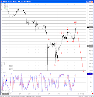
This is a daily chart of US Mid-Caps. I believe the September rally is a final part to the correction that began in early July. This final part is now nearly complete. Shorting everything and anything is advised on any "pops" higher.

Wednesday, 1 September 2010

Risk Likely Bottomed.

Equities have likely bottomed for some time.

Monday, 23 August 2010

Asset Markets To Rally

The previous forecast for an imminent top in risk and related assets was somewhat early, and about 1-3% away from what proved to be the tops.

I am not very happy with how risk sold-off since then, and therefore expect another rally to challenge the August 2010 peaks.

I expect substantial weakness in the Autumn, possibly beginning in early September. This will likely coincide with sub-50 ISM, revisions of Q2'10 US GDP down to 0.8-1.2% and possibly negative Q3'10 GDP in the USA.

This is a daily chart of Microsoft, which I expect to rally strongly (around 12-14%) in the next two weeks.

This is a daily chart of Bank of NY, which I also expect to rally strongly (around 12-14%) in the next two weeks, along with other Financials.


Tuesday, 27 July 2010

Strength In Asset Markets Likely Over Soon

The forecast made in the beginning of July, of a multi-week, 7-8% bounce in risk and related assets, has come to pass.

I believe that this strength is likely to be over soon, with a potential for sustained weakness beyond June/July lows.

Below is a daily chart of the FTSE100 index (London). For various reasons, I believe this chart to offer one of the cleanest "counts", where the most plausible outcome is sustained weakness from current levels.

Monday, 5 July 2010

Very Oversold, But Still Room To Go

On a number of metrics, the current "risk trade" is extremely oversold. Taking G20 equity indices, I believe that a multi-week, roughly 7-8% bounce is quite close. However, both internal structure of the market so far, and slightly longer-term indicators suggest that further short-term weakness is highly likely.

The number of stocks, included in the SP500 index, that are trading above their 50 day moving average is fast approaching levels not seen since the March 2009 bottom and the panic of October 2008. Previously, stocks have always bounced from similarly oversold levels.

There is still a fair bit of room before the market is terminally oversold though, as shown by the number of SP500 stocks that are trading above their 200 day moving averages, in the chart below.
Here on the daily SP500 chart, both the RSI and Stochastics are extremely oversold. The index is alos sliding along the lower Bollinger band. I expect a move lower short-term, followed by a multi-week bounce, as shown by red lines.


More downside?

So far, the larger “irregular” count I have been following is working out well.

Again, so far, we had a very neat impulse lower in the EZ banking sector. Surprisingly, Spanish and French banks have been noticeably stronger than, say, German or Skandi banks.

That notwithstanding, they have also, on hourly charts, traded beautiful little corrections (abc in lower case on the chart).

This is quite a count… if it is correct, the market will collapse in the next 3-4 sessions.

I expect a bottom to hit around mid-next week.

This is an hourly chart of the Spanish bank Santander:

Monday, 21 June 2010

Fireworks, Fireworks, Fireworks.

I am now on full alert for rapid declines in risk and related assets.

As suggested in my previous post and pointed at in the accompanying charts, risk and related assets have likely peaked from slightly higher levels from Thursday last week.

I believe that today’s (post Chinese announcement) highs might turn out to be fairly secure stop loss levels for short-risk trades.

It is likely that there will be some form of a retracement (a move higher) in the next 24 hours.

No charts today.

Thursday, 17 June 2010

Fireworks Alert!

The first "Fireworks" alert, last week, was too early and wrong.

I believe we are coming up to the end of corrections higher in risk and related assets that began at the end of May. While attention has been focused on problems in Europe, where Southern Europe significantly underperformed the North due to credit strains, little has been said about dreadful performance of the world's manufacturing and industrial centres.

Below is a selection of Asian indices, all of which are very sensitive to growth in the global economy.

A very clean impulse lower in Australia, with a neat correction higher. This index has also produced the "death cross" on the daily chart (55 day moving average crossing the 200 one from above).

Also a very clean impulse lower in Hong Kong, with a neat correction higher. This index has also produced the "death cross" on the daily chart (55 day moving average crossing the 200 one from above).

Finally, another clean impulse lower, this time in Singapore, with a neat correction higher. This index has also produced the "death cross" on the daily chart (55 day moving average crossing the 200 one from above).

A good proxy for Risk - NZD/JPY is about to finish its correction higher, possibly around the coming week-end.

And finally for today, crude oil is also likely about to finish its move higher very soon.

Wednesday, 9 June 2010

Fireworks!

I think risk and related assets are about to get slaughtered. Get ready for something very messy.

Friday, 28 May 2010

Market is likely to break lower from current levels

I believe that we are approaching the end of the correction that began on Tuesday of this week.

Risk and related assets will likely sell-off soon.

Friday, 21 May 2010

Kiss of Death?

First, my alternative, temporarily bullish count. On a number of metrics, this market is extraordinarily oversold. Usually, this would lay the foundation for a healthy rally. To accommodate this scenario, I propose an eminently probable count.

On this hourly chart of the CAC40, we may have just finished the "B" wave, pending a near vertical rally to just above (or so) the levels we saw after EU-TARP was announced. If so, it would be a wonderful shorting opportunity!

Following the biggest market drop since March 2009, the market is, I believe, retracing to the broken trendline. This is also known as the "kiss of death".

I expect the market to fall away from this point. In addition, should today's lows be taken out on the major indices, (where those lows coincide with the "flash crash lows" of May 6), the bottom is likely to fall out of the market.

This is a daily chart of the US Energy Sector, which today touched the underside of horizontal resistance in red.

This is a daily chart of JPMorgan, and the chart looks very similar to that of the whole US Financial sector. Today, the stock touched the underside of the broken trendline, in red.


Wednesday, 19 May 2010

Crossroads

The market is at a crossroads.

If we take out the lows of today, the market is likely to fall in a waterfall, wave 3 decline. If the market takes out yesterday's highs, it is likely that we go on to challenge post EU-bailout highs in wave C of II (or B).

I lean strongly towards an immediate breakdown for a number of reasons. A few of those are time cycles, a number of large cap stocks in G10 are very weak, and the low today has been made in a three-wave corrective spike, suggesting that it was a "b" wave of an irregular correction, pending more downside.

Thursday, 13 May 2010

Correction Higher Is Likely Over

The aftermath of the "flash crash" and the European debt crisis is long forgotten, as markets are challenging strong resistance levels (highlighted by the red line in the hourly chart of the SP500 futures in the chart below).

The entire advance from the "flash crash" low appears to be taking shape of a zig-zag, with several hallmarks that define such structures: a) very sharp movements; b) wave "a" and "c" equality; c) diminishing volume relative to the impulsive move that preceeded it; d) retracement of the "extension".
It is therefore my belief that global equity markets are about to take the turn for the worse imminently (within the next 2-3 trading sessions).

Tuesday, 11 May 2010

Corrections Higher Likely Finished

It is likely that the bail-out induced euphoria will very soon give way to dispair, as equities turn around and head lower.

This is an hourly chart of the US Mid-caps, which highlights a very technical, so far, corrective zig-zag higher. I believe it is about to reverse.

Monday, 10 May 2010

Fool's Gold - Sell This EU Spike

Markets have taken a few Ecstasy pills and are seriously high. I do not think this will last.

Major European and US averages traced out beautiful corrective zig-zags to the upside. Similarly, the time-old market indicator - Copper is also quite weak today, and is likely finishing its correction higher.

Finally, Asian indices have not at all participated in this rally, even though they fell a fair bit in line with Europe.

In short, go SHORT.

Thursday, 6 May 2010

Correction Underway

Markets complied with very strong indications of reversals.

Currently, it appears that the moves from end of April highs are coming to an end. It is quite likely that we consolidate for a few days, then make one more low, and then consolidate for much longer.

It appears that EUR and CHF are basing against the USD.


Friday, 23 April 2010

The Fun Ought To Continue Soon

Last week, the "fun" started shortly after my post.

On cue, Emerging Markets sold-off having finished their impulsive ascent from February lows. Currently, this instrument appears to have finished the correction higher, and should carry on lower soon.

Similarly, the US Broker-Dealers' index (where Goldman Sachs is the largest component) also appears to have finished its correction higher, and ought to fall imminently.

And finally for today - the Real Estate sector in the US. The pattern could not get any more perfect. This particular market is about to sell-off very hard.

Thursday, 15 April 2010

The Fun Ought To Begin Soon

Since Easter, European markets have stalled, and are effectively flat. US and some Emerging Markets are moving much higher. I continue to believe that this is not going to last.

From wave analysis:

The CRB index is ready to fall in a rather rapid third wave decline:

Emerging Markets moved to new highs (as forecasted all the way back in February 2010) in what appears to be a finished impulse:


The quality of this rally [specifically in Europe] remains very poor. Since the March’09 lows, there has been no price thrust that remained out of reach of a subsequent correction lower. However, the latest rally (from February’10 lows) appears to be impulsive. While this strongly points to a coming multi-week correction, it also suggests an absence of imminent collapse. I believe the most likely scenario will be one of extended range trading, as what I expect to be the final zig-zag forms.

From other indicators:

This rally is becoming more and more speculative in nature, as total volume on the NASDAQ is running into record territory relative to that of the NYSE:
Sentiment is in record bullish territory: according to CBOE never before have so many calls been bought relative to puts. At the same time, ISE Equities only index’s moving average measure is moving in on levels last seen in July and October 2007.
Relative to historic norms, the market is under pricing near-term (1 month) volatility relative to medium-term (3 month) volatility, as shown by the blue line in the chart below (ratio of VIX to VXV).

It is often said (past couple of months) that the market’s internals are very strong, as shown by the ever rising cumulative advancing-declining issues count, shown below. It also true that major tops during the XX century have all been accompanied by deterioration in breadth. This does not rule out a decline of about 10-15% now, followed by an advance, by most US averages to new highs, this time not accompanied by a rally to new highs by the AD line. This is how the top formed in 2007.

Finally, the McClellan oscillator has shown negative divergences prior to all market tops. It is doing so now:


Monday, 5 April 2010

The End-Game

Nothing like being two weeks (so far) early in calling a top to dent one's confidence, but as Chuck Prince said: "While the music is playing, you have to get up and dance - we are still dancing" - got to keep dancing!

Only thing is, I firmly believe that the music is about to stop, at least for a few weeks. On a number of metrics, including put/call ratios, VIX/VXV ratios, recent to older advancing/declining issues ratios - the market is as, if not more overbought than at a number of intermediate-term tops since at least 2000.

There are a couple of counts that I am following for major equity markets.

The only way in which they differ is where wave 4 ended and what I expect to be the final advance began. In either case, the most bullish projection that I can come up with extends to about 1200, and then comes off hard.

Both of the charts below are hourly S&P500.